This is the whole product
Every voting platform says it is easy to use. Here is ours, in 10 screenshots of the real software, each captioned with something checkable. The three places a competitor does this in fewer steps are on the page too.
“In our case, setup would have required only a few minutes of effort from management or the Board.”
Build
Building the election
From an empty account to a published ballot.
The template library: 68 state-written starting points
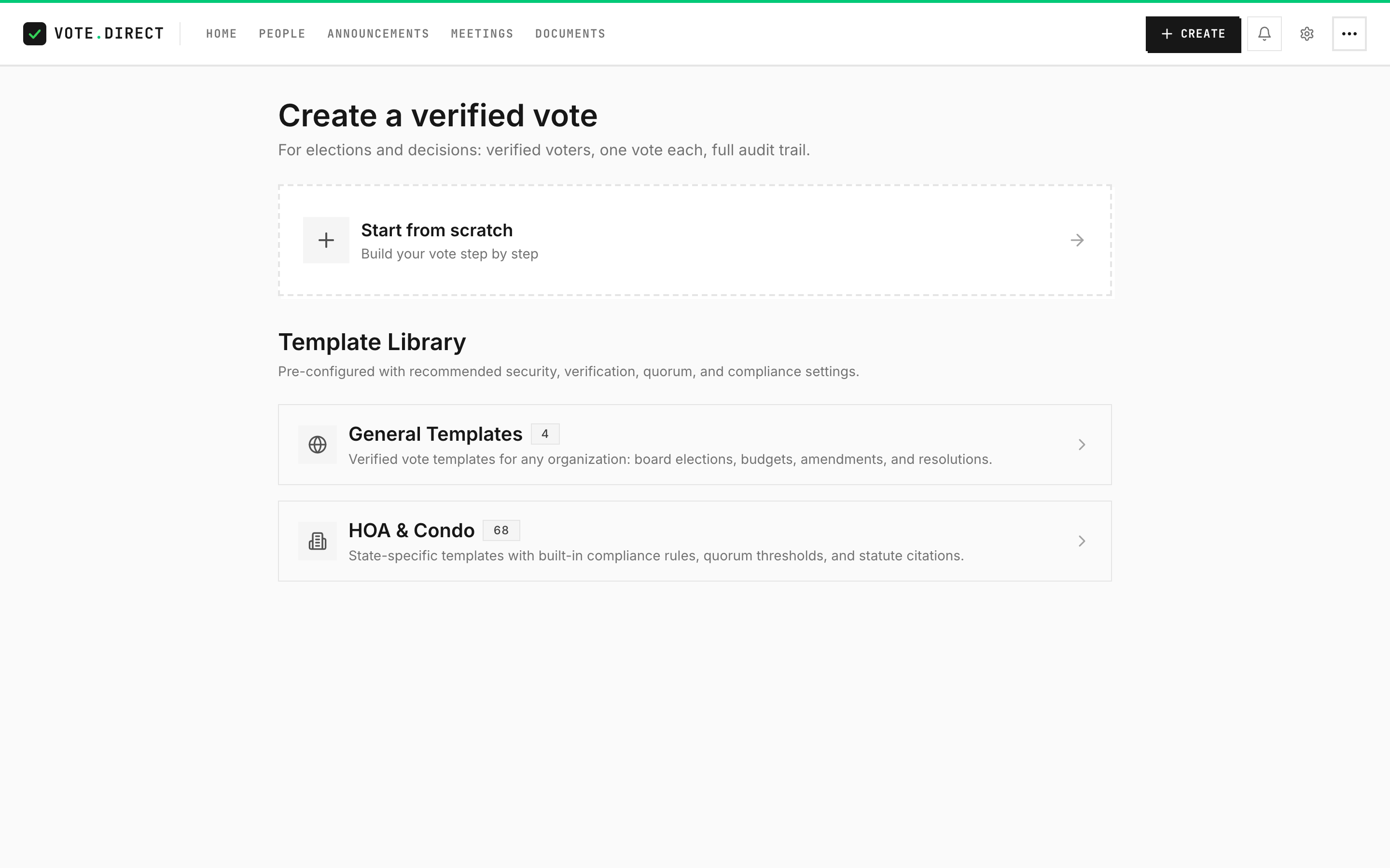
The library holds 68 association templates across 22 states, plus four generic ones. Each one writes real settings onto the election: the state code, the community type, the vote type, the verification level, and the quorum. Read the template description before you publish; several tell you to change the preset quorum.
Nine question types on one screen, none of them behind a plan
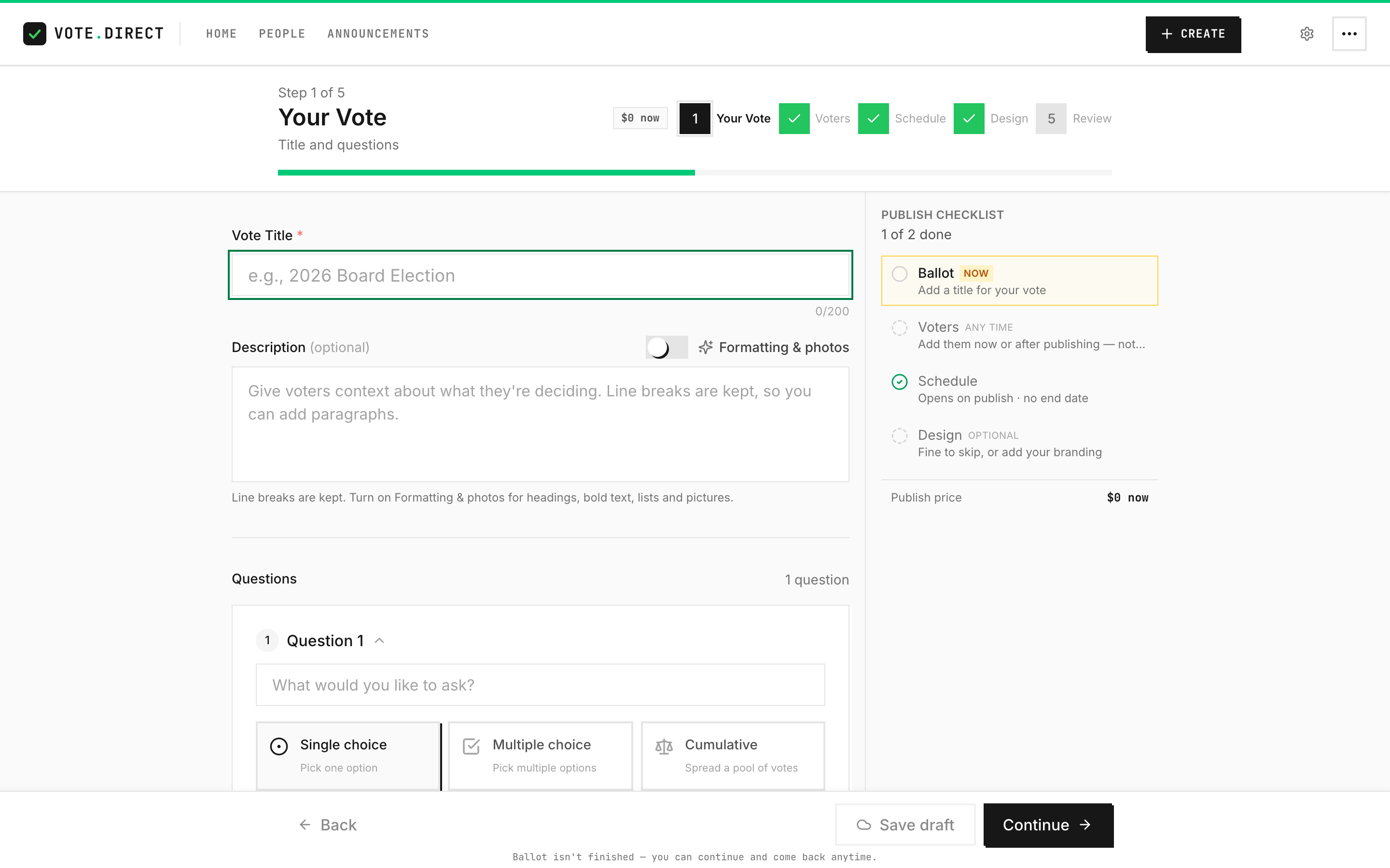
Single choice, multiple choice, ranked choice, cumulative, approval, scored, yes/no, rating and open text, all on one list with no tier check in it. Ranked ballots can be counted four ways — instant runoff (RCV), single transferable vote (STV), Borda, or Condorcet (Schulze) — and cumulative is the one governing documents mean when they say a member may cast all of their votes for one candidate.
The voter roster: publishing never waits for it
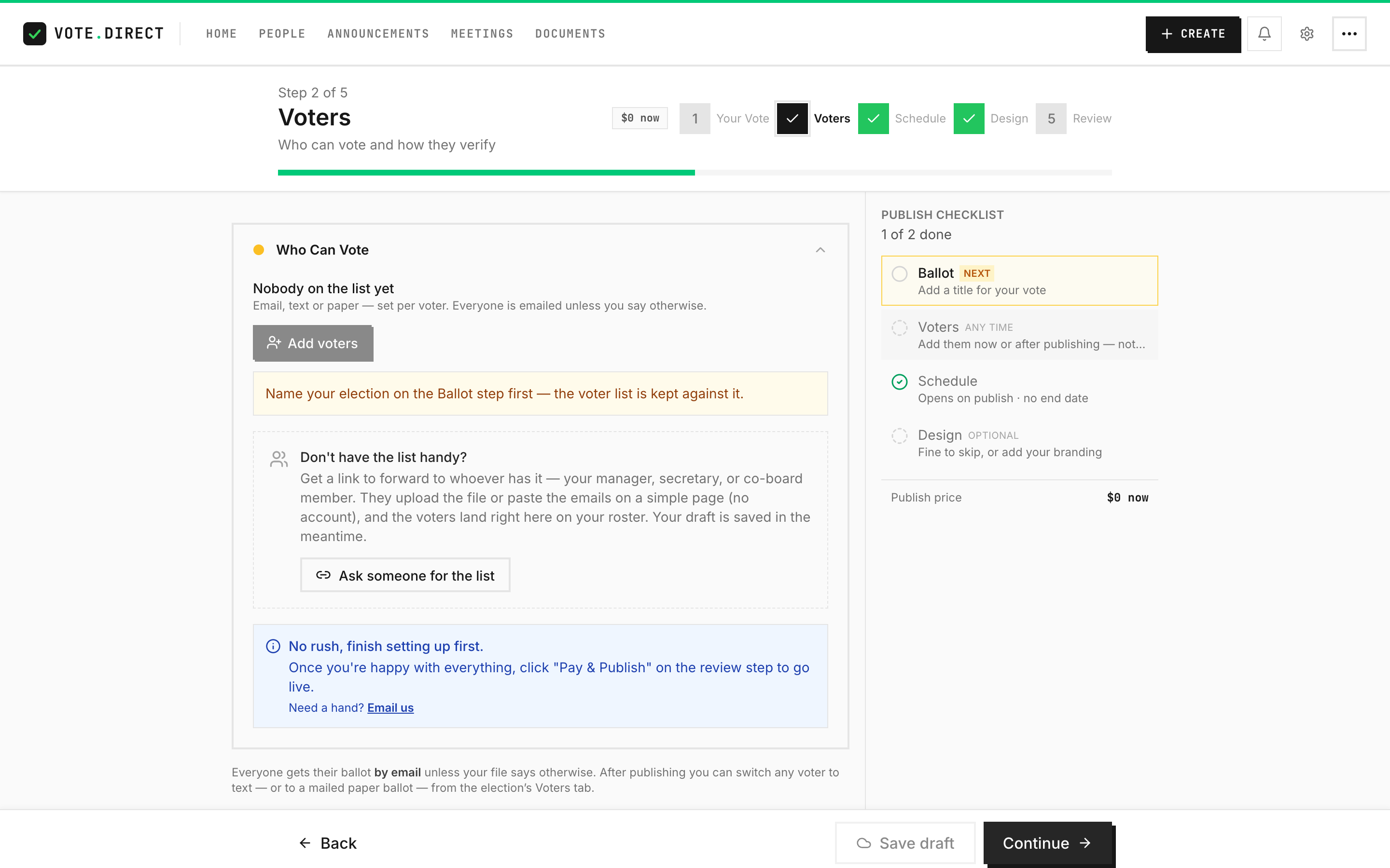
An election with nobody on the roster publishes, and publishes free: the charge lands the first time a list exists. "The manager still owes me the spreadsheet" is a normal Tuesday, not a dead end.
Roster request: a link for whoever holds the list
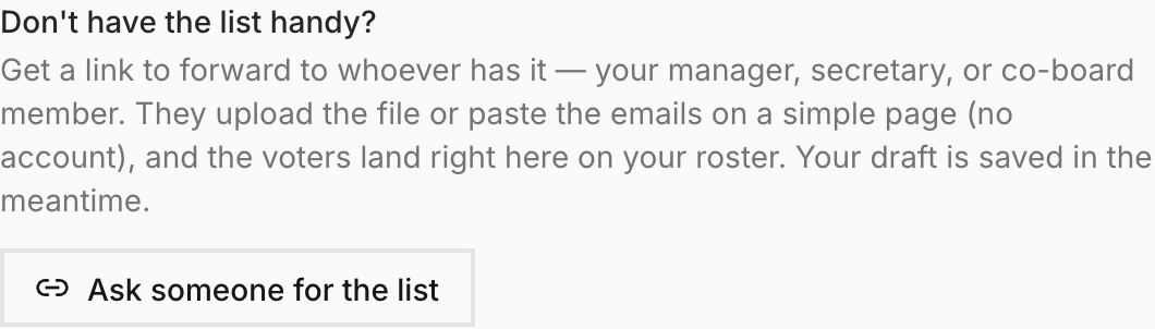
Forward the link to the property manager or the secretary. They upload the list without making an account or seeing the ballot, and the names land on your roster. The link expires after 14 days.
Scheduling: opens on publish, end date optional
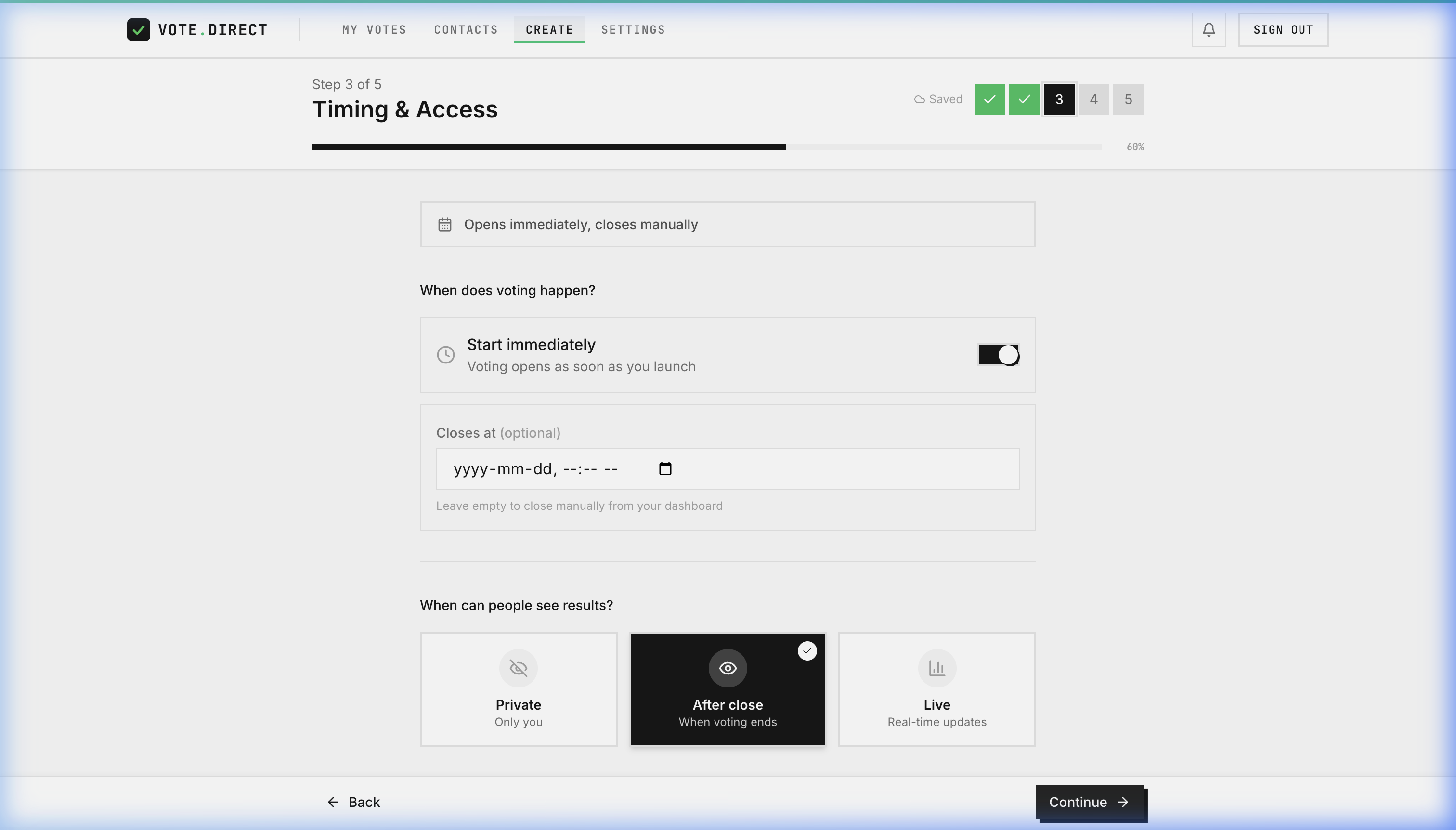
"Start immediately" is on and the close date is empty by default, and that publishes: a board closing the vote at the meeting does not have to invent a date. The rules here fire when a date is wrong, never when it is absent. An election with no end date passes.
5 steps, four of which carry rules
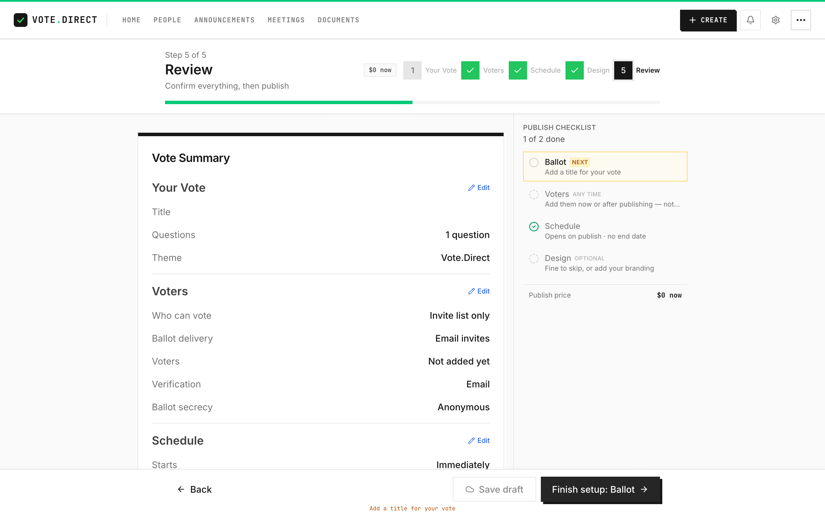
Moving between steps never blocks. Only Publish enforces the rules, all of them at once from one list, so the tracker, the step ticks and the button cannot disagree. Design carries no rules at all: a color scheme is not a reason to refuse an election.
The publish checklist: only required rows gate the button

With an empty roster the Voters row reads: "Nobody can vote until someone is on the list." That row blocks, because publishing an invite-list election nobody is on reaches nobody. Design reads: "Fine to skip, or add your branding," and never blocks anything: a color scheme is not a reason to refuse an election. Only required rows count toward the publish gate, so an optional row can never silently block you.
Prove
Prove it before anyone sees it
The step between "I think this is right" and the mail going out.
Test ballots: the real thing, 5 times, free

5 free email or text tests per election; a mailed test packet is charged like a real one, because it is one. A test is a hidden copy of the election with you as its only voter, sent down the production path: the same link, the same verification code, the same ballot, the same receipt. Your real roster, results and invoice never see it.
Vote
What the member sees, and what you get back
The screen a homeowner opens on a phone, and the one the board watches.
The ballot your members open
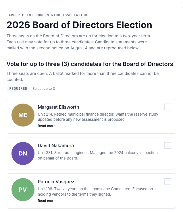
A board election as a member sees it: candidate statements on the ballot and the select-up-to rule in plain words, on any phone or computer. Captured from the demo condominium's live election in the production product, not a mockup.
Live results, with quorum tracked
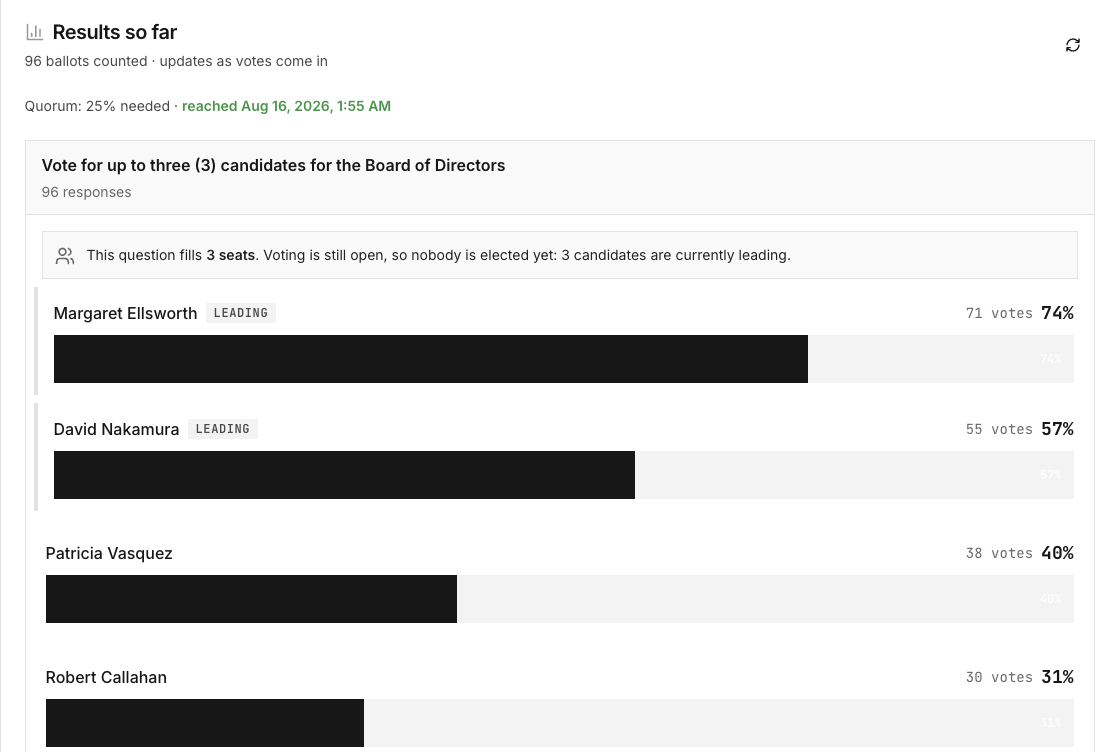
Ballots counted as they arrive, quorum tracked against your threshold and timestamped the moment it is reached, leaders marked. Seats are called only when voting closes.
The other side
Where this is not the easiest one
Three things a competitor could fairly say about the screens above. We would rather you read them here than find them on a demo call.
A second step before the ballot. OpaVote skips it.
OpaVote emails an access code and the voter is on the ballot. vote.direct takes a second step: the voter types the code we email, or taps the button in that email and then Continue, and only then does the ballot render. The Continue tap exists because workplace mail filters open every link in a message, and a link that verified on opening would verify the filter instead of the voter. If you are counting taps, they win.
What the second step buys is an event: verifying writes a voter_verified entry naming the voter and the method, or voter_assisted_verified when an administrator issued the link on their behalf. Afterwards, how a ballot was reached is a record rather than a recollection. If your election will never be questioned, that step bought you nothing; buy the cheaper one.
ElectionBuddy markets three steps. This is five.
Counting screens is a contest we would lose and you would learn nothing from, because a wizard can always be made shorter by asking the same things on fewer pages. The number that decides whether you get stuck is how many rules can refuse to publish.
There are 25 across the whole wizard, and on a brand-new ballot three fire: give it a title, give each question its text, and give each choice question two real options. A voter list is not one of them. An election with no end date passes.
We are not going to tell you how many minutes it takes.
Nobody here has timed a real run with a real board and a real roster, so there is no number to publish, and inventing one would undo every fact on this page.
The nearest evidence is the sentence at the top, written by somebody else about their own case, with nothing to gain from it. It is still one association.
Not our words
What people who are not us have said
Screenshots are still our screenshots. This is the part of the page we do not control, including the size of it.
How much outside evidence there is, exactly
vote.direct has 6 public third-party reviews: one on Capterra and 5 on Trustpilot, all of them 5 out of 5. Trustpilot's profile displays a TrustScore of 4.1 rather than 5.0, even though its own histogram reads 100% five-star, because a TrustScore is a weighted average that starts a new profile near 3.7 and only moves to the real mean as reviews accumulate. Both numbers are honest; that one is theirs and we do not get to change it. 6 reviews is not a track record either, and no board should choose a voting platform on the strength of it. ElectionBuddy, Simply Voting, and OpaVote have all been running elections far longer and have the independent reviews to show for it. If review volume is your deciding factor, they win it outright and this page will not talk you out of that. What we can do is show you every review we have in full, including the parts that are critical of us, and link them so you can confirm we did not edit them.
Secure, Transparent, and Easy-to-Implement HOA Voting Solution
Anonymous reviewer, Non-Profit Organization Management. 5 out of 5 on Capterra, May 2026.
vote.direct provided a secure and genuinely anonymous voting solution at a time when our HOA urgently needed an alternative election platform. [sensitive content hidden] personally worked over a weekend to help prepare a complete proposal for our Board and answered every question clearly and patiently in non-technical language. I especially appreciated the platform’s focus on voter verification, auditability, ballot secrecy, and compliance while still keeping the process simple and affordable for the Association to implement. In our case, setup would have required only a few minutes of effort from management or the Board.
What they marked as cons: I honestly did not identify any major negatives during my experience. Because the platform offers strong security and compliance features, there is a lot of information available, so organizations unfamiliar with election terminology may initially need some guidance. Fortunately, [sensitive content hidden] was extremely helpful in walking through everything step by step.
Quoted in full and unedited. The bracketed redactions are Capterra's own: it strips personal names out of review text. Both refer to the founder.
That review is worth reading in full because of what the customer chose to lead with. They were not asked about support, and they wrote that someone at vote.direct worked over a weekend to prepare a proposal for their board and answered every question in non-technical language. It is the same claim this page makes about founder-led support, made by someone with no stake in repeating it.
The fastest way to check any of this
Build a ballot and send yourself a test of it. The test is a real election with you as its only voter, so the screens above are the screens you get. If something on this page is wrong, the number below reaches the person who wrote both the page and the code.